Candid had a mobile app that people really hated. People also called into support a lot and that costs the company money. I led design fixing the app to reduce costs and increase customer satisfaction.
Executive summary
Who?
I lead design on this project, working with product managers and developers. I had some assistance brainstorming and solving a few UI problems from another product designer on our team.
When?
September — November 2019
What?
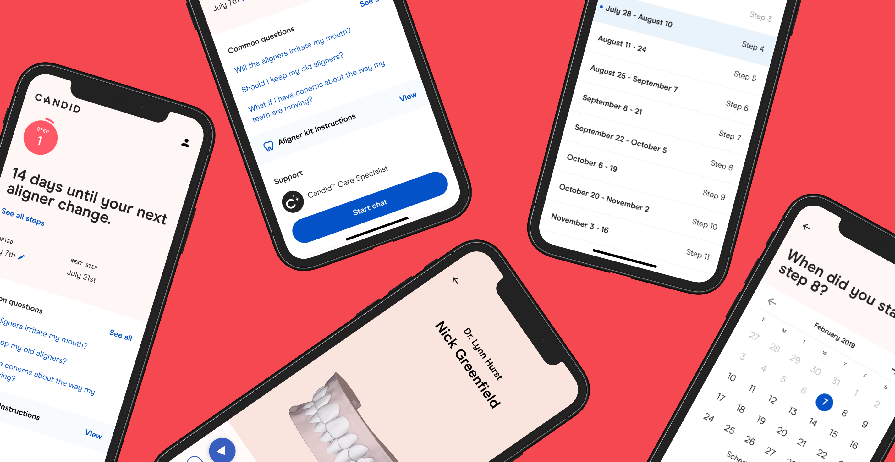
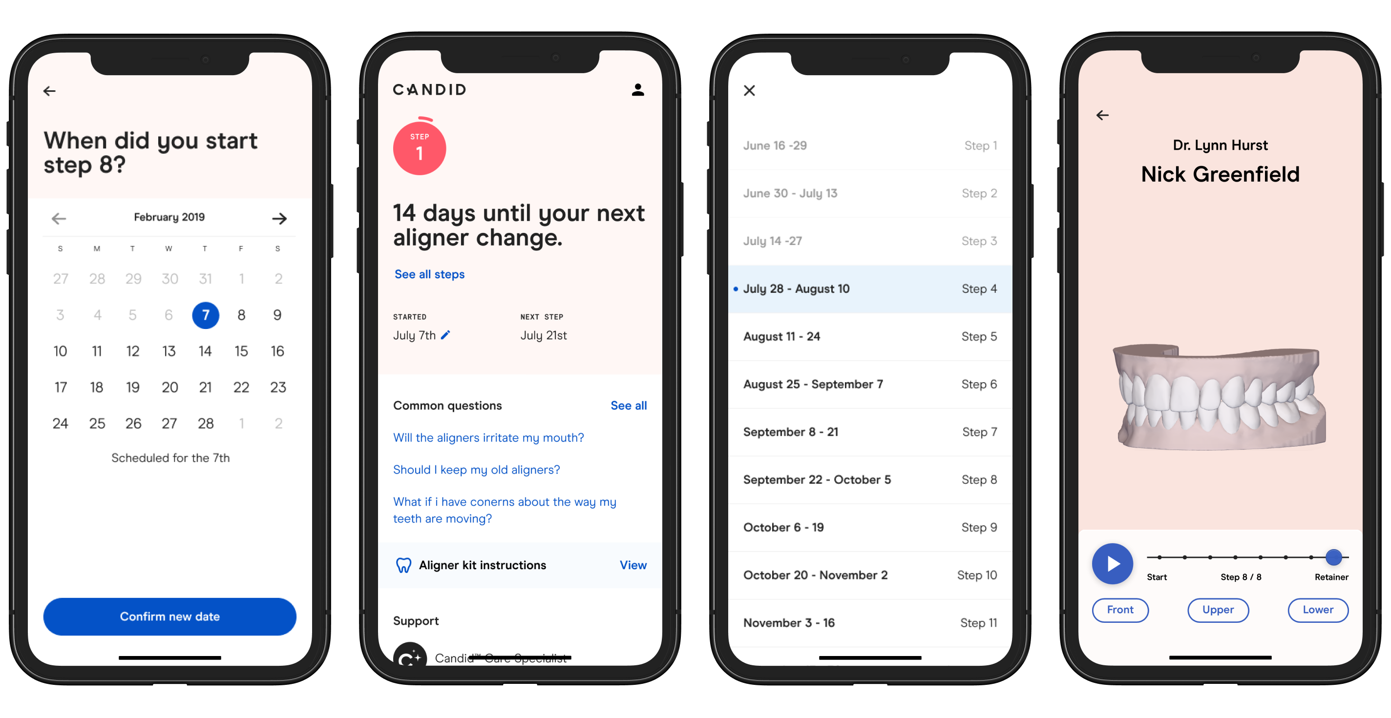
The in-treatment experience for the Candid mobile app.
Why?
Customers had missing or inaccurate aligner change reminders, a lack of tools to understand if their treatment was on track, and a lack of support in triaging issues. In many cases, customers turned to our support team to fill these gaps, resulting in additional support costs and frustrated customers.
I lead design on this project, working with product managers and developers. I had some assistance brainstorming and solving a few UI problems from another product designer on our team.
When?
September — November 2019
What?
The in-treatment experience for the Candid mobile app.
Why?
Customers had missing or inaccurate aligner change reminders, a lack of tools to understand if their treatment was on track, and a lack of support in triaging issues. In many cases, customers turned to our support team to fill these gaps, resulting in additional support costs and frustrated customers.
Impact
- Raised the app star ratings from 2.9 up to 4.3 stars
- Between 80 and 100 chats started daily, greatly reducing support email volume
- Opened new channels for customers to buy retainers and whitening foam—increasing customer life time value
Starting point: prior research
User research conducted earlier in the year showed that in-treatment customers were frustrated by:
- Missing or inaccurate aligner change reminders
- Lack of tools to understand if their treatment was on track
- Lack of assistance in solving their treatment issues
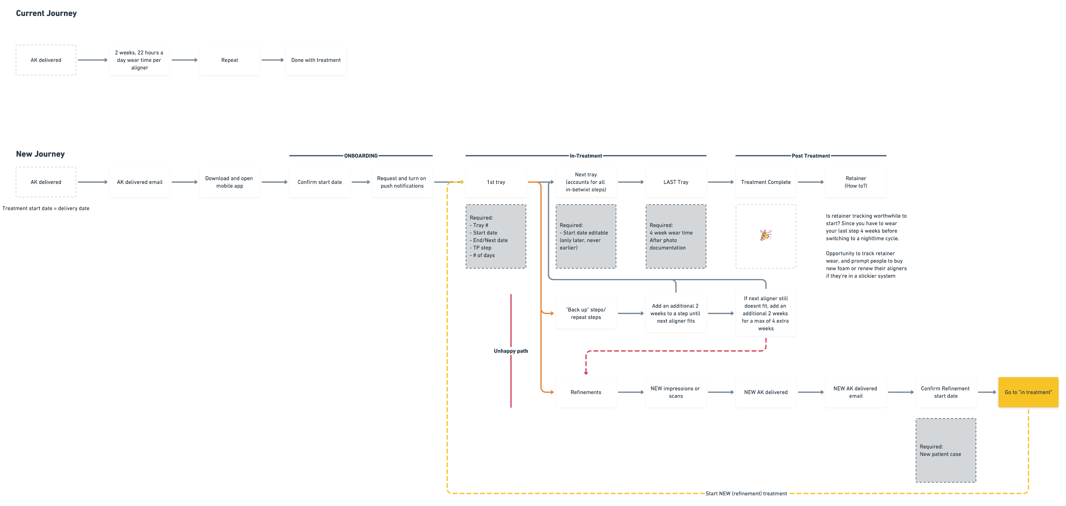
Mapping the journey against the constraints, goals, and requirements
Before thinking about how this should take shape, we took a moment to write out our goals, the requirements, and high level questions complete with a 10,000 ft view of the current customer journey.
Doing this allowed us to center on what we were trying to solve and provided a framework to determine what wasn't necessary. Anything superfluous would be shelved. We then mapped out the new journey with these things in mind.
Customer requirements:
Doing this allowed us to center on what we were trying to solve and provided a framework to determine what wasn't necessary. Anything superfluous would be shelved. We then mapped out the new journey with these things in mind.
Customer requirements:
- Customers need to be able to indicate when they started treatment. Not everyone starts the day their aligners arrive.
- Aligner change notifications and the ability to fix their treatment schedule themselves, should they start a step late
- Customers need to be able to view the instructions for their aligner kit
- Access to their account information and basic functionality
- Access to support
Starting low fidelity
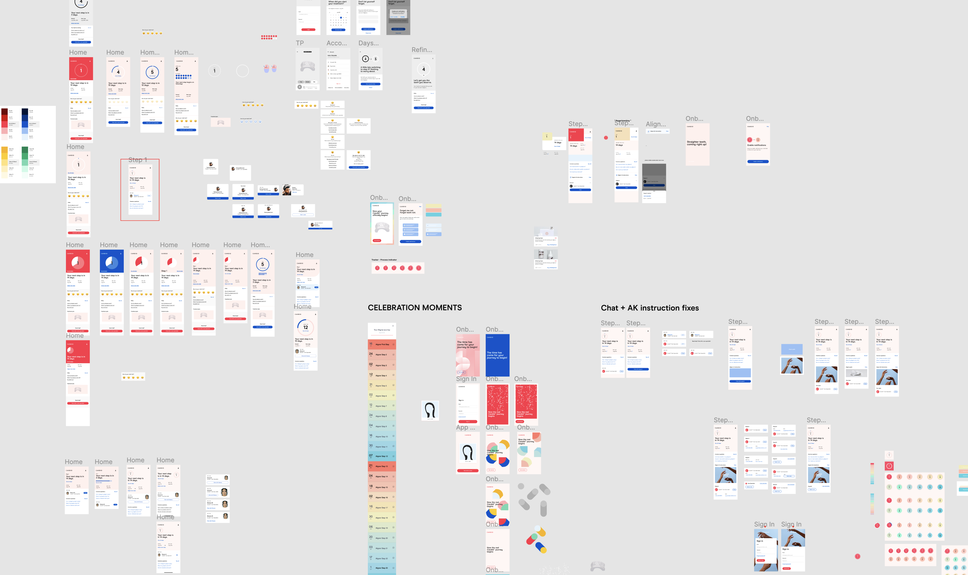
Crazy 8's
I sat down with another designer on our team and each sketched out 8 potential solutions in 8 minutes. This allowed us to get low hanging fruit ideas out of the way. Some of the concepts we came up with here made it all the way into the final product.
I sat down with another designer on our team and each sketched out 8 potential solutions in 8 minutes. This allowed us to get low hanging fruit ideas out of the way. Some of the concepts we came up with here made it all the way into the final product.
Extensive wire frames
Since this was a ground up overhaul of the experience, I underwent several rounds of iteration with wireframes. This process allowed me to block out the layout.
Since this was a ground up overhaul of the experience, I underwent several rounds of iteration with wireframes. This process allowed me to block out the layout.
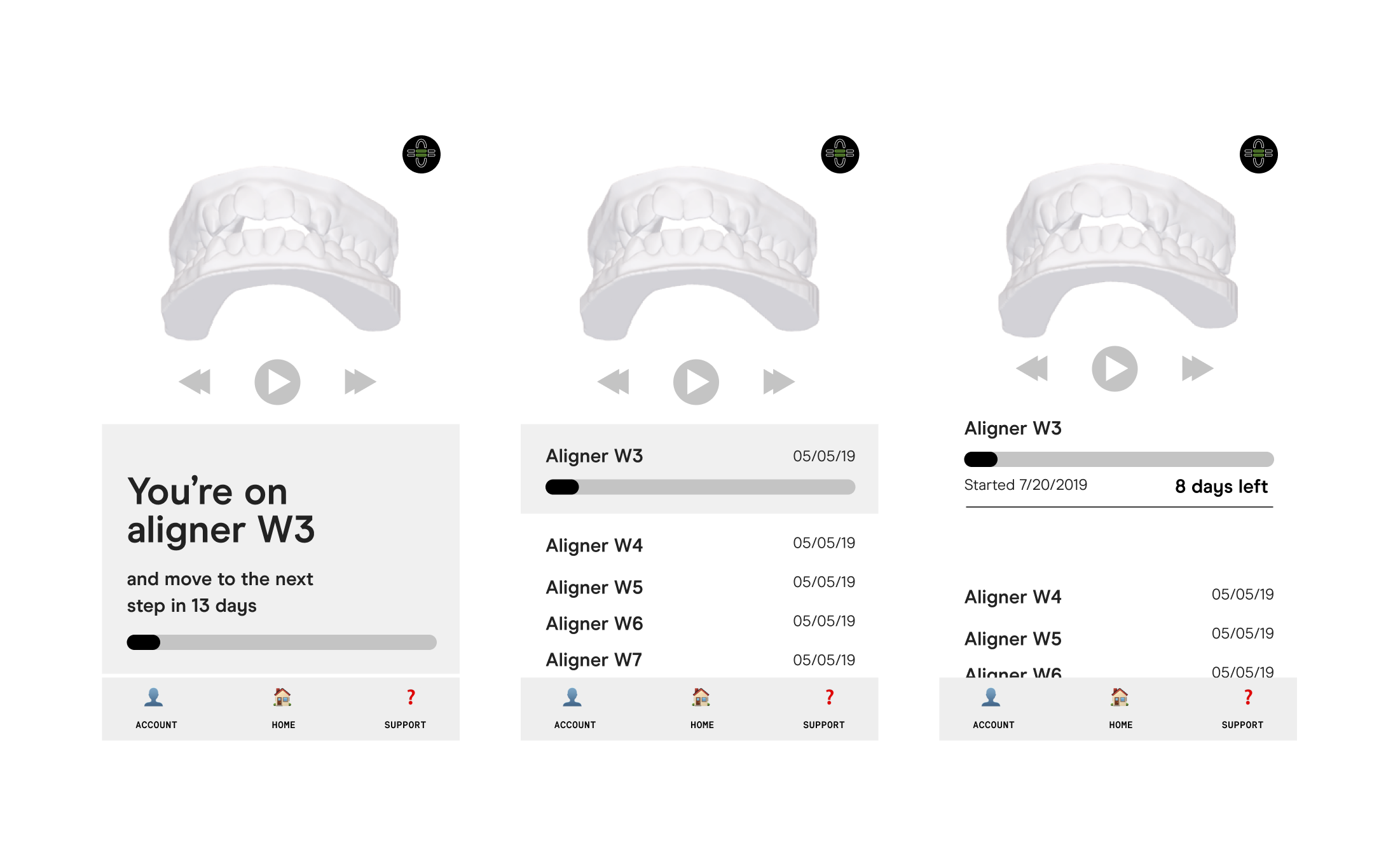
Early on, we were very focused on surfacing the current aligner step at the top of the app. We had heard that customer's were always looking at the 3D models of their teeth and flipping through each step to watch how their teeth will move.
This, however, turned out to be the opposite of what we wanted. The orthodontists we work with strongly dislike that we allow patient's to return to their treatment plan because it sets unrealistic expectations in stone. Essentially, you are a human, not a 3D model. Your teeth will probably look different than a floating model will. This revelation lead us to strongly deemphasizing the treatment plan itself, and instead focused on the current moment in time more abstractly.
This, however, turned out to be the opposite of what we wanted. The orthodontists we work with strongly dislike that we allow patient's to return to their treatment plan because it sets unrealistic expectations in stone. Essentially, you are a human, not a 3D model. Your teeth will probably look different than a floating model will. This revelation lead us to strongly deemphasizing the treatment plan itself, and instead focused on the current moment in time more abstractly.
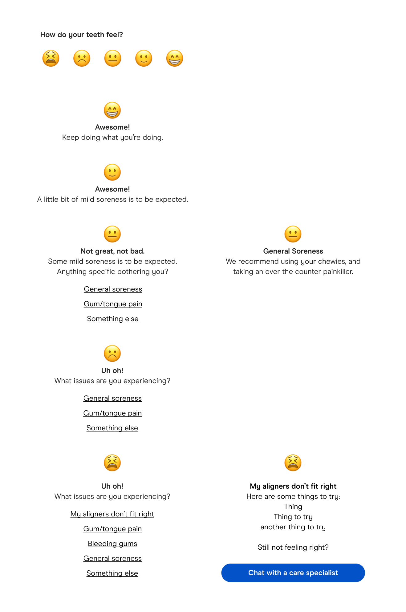
“I have no idea what I’m doing.” – Most Candid patients
Candid patients on average are not sure if their treatment is going according to plan or if the pain they're feeling is normal. At the time of this project there was no clear way for them to find out. To solve this pain point, I came up with the concept of simply asking patient's how their teeth felt. However, this ended up being cut from the final product because it did not directly level up to any of the goals we had initially set, and was therefore out of scope. Instead, we made sure to solve these pain points by surfacing relevant FAQs without actually increasing the project's scope.
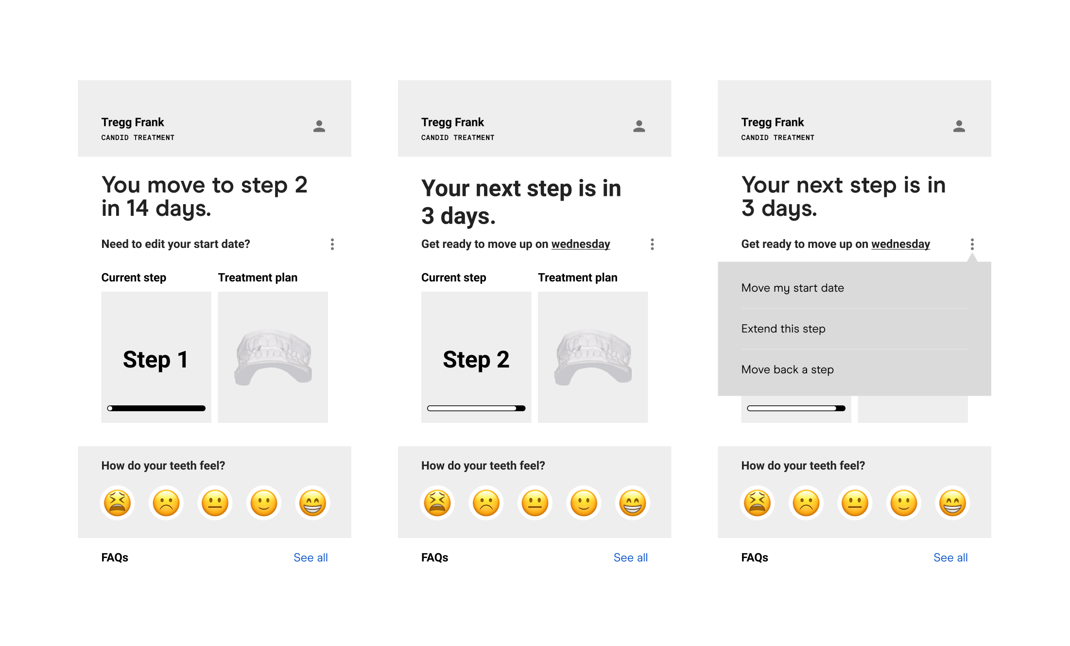
Aligning hierarchy & value proposition
The in-treatment experience is primarily a single page with a few branching interactions. The decision to keep it extremely simple was made in favor of increasing the discoverability of all the app's primary functions. To ensure optimal usability, we were very intentional when establishing the app's visual hierarchy.
This focus on hierarchy allowed us to establish the top module of the app as sacred ground for important treatment information.
This focus on hierarchy allowed us to establish the top module of the app as sacred ground for important treatment information.
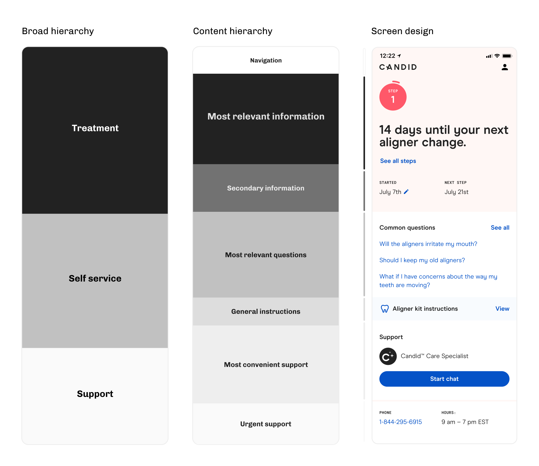
In the following example you can see how the secondary information section is flexible enough to allow for important messages and prompts while not distracting from the core functionality of the application.
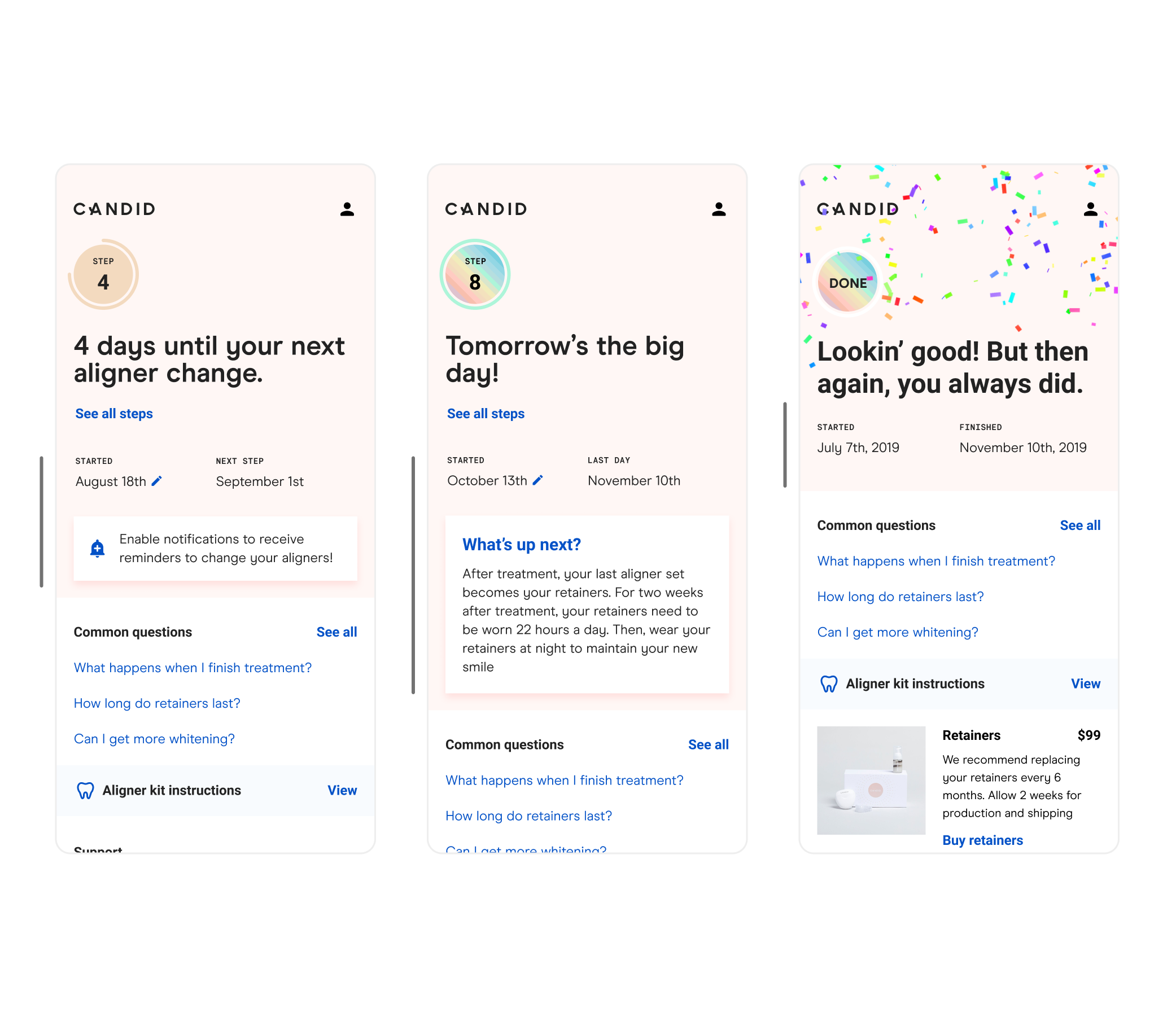
Human moments
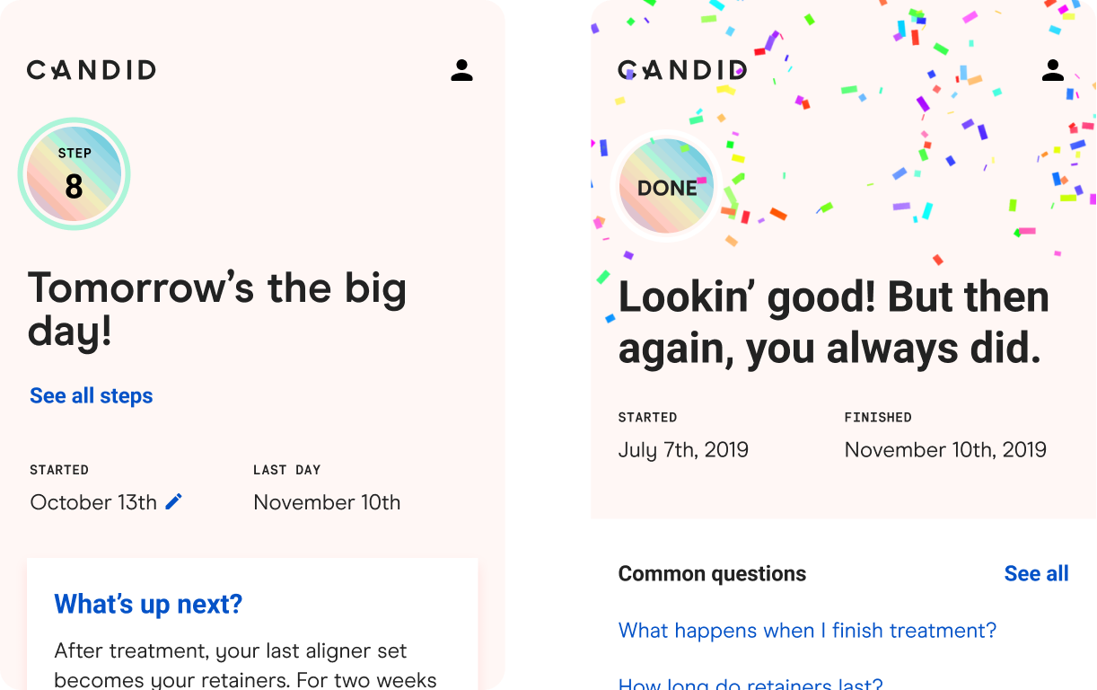
Straightening your teeth hurts. It's important to celebrate the journey these people go on; it's incredibly tough. It's a whole life change. With the help of our amazing copywriters, we made sure to inject some delightful human moments and moments of celebration into the treatment experience.
- For the last step of treatment, the treatment tracker turns into a rainbow, containing all of the colors from the aligner kit box
- On the very last day of their last step, the copy at the top of the app changes to "Tomorrow's the big day!"
- Once treatment is done, the treatment tracker shows they are done, confetti rains down, and we compliment them. They earned that confetti with a long, painful process; it's the least we could do
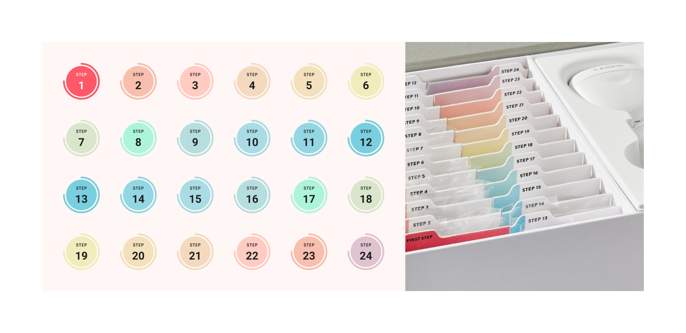
The fancy changing colors have a meaning
The Candid aligner kit is packaged beautifully. Our customer's favorite thing to do when they get their kit is to make a boomerang Instagram story showing them opening the box the first time. The kit is organized like a filing cabinet, with each step having it's own unique colored tab. The treatment tracker in the app mirrors these colors.
Next steps
We are continuing to learn how customers interact with Candid across the funnel, including in-treatment with the mobile app. With a recent launch of a product called Dental Monitoring, the mobile app's role is going to change a bit as treatment schedules are different for every patient and adjust based on the patient's progress.
However, there are two clear areas of improvement we could make right away based on customer feedback:
However, there are two clear areas of improvement we could make right away based on customer feedback:
- Improvements to the chat interface. This is provided by a third party currently. It’s not a great experience, and it is often more confusing than it's worth for the customer.
- More relevant in-treatment frequently asked questions. The whole Candid experience tends to feel very "top heavy" in that we focus our content on new customers. Our patients want FAQs that are tailored to their current experience going through treatment.
Despite that, this was a good exercise in delivering a differentiated customer experience for Candid that allowed us to truly be customer centric while still delivering business value.