Stark for Mac audits your designs for accessibility issues in seconds. It was designed over two years and built in Swift UI. I led design on this project.
Overview
LaunchedSeptember 27th, 2022
Description
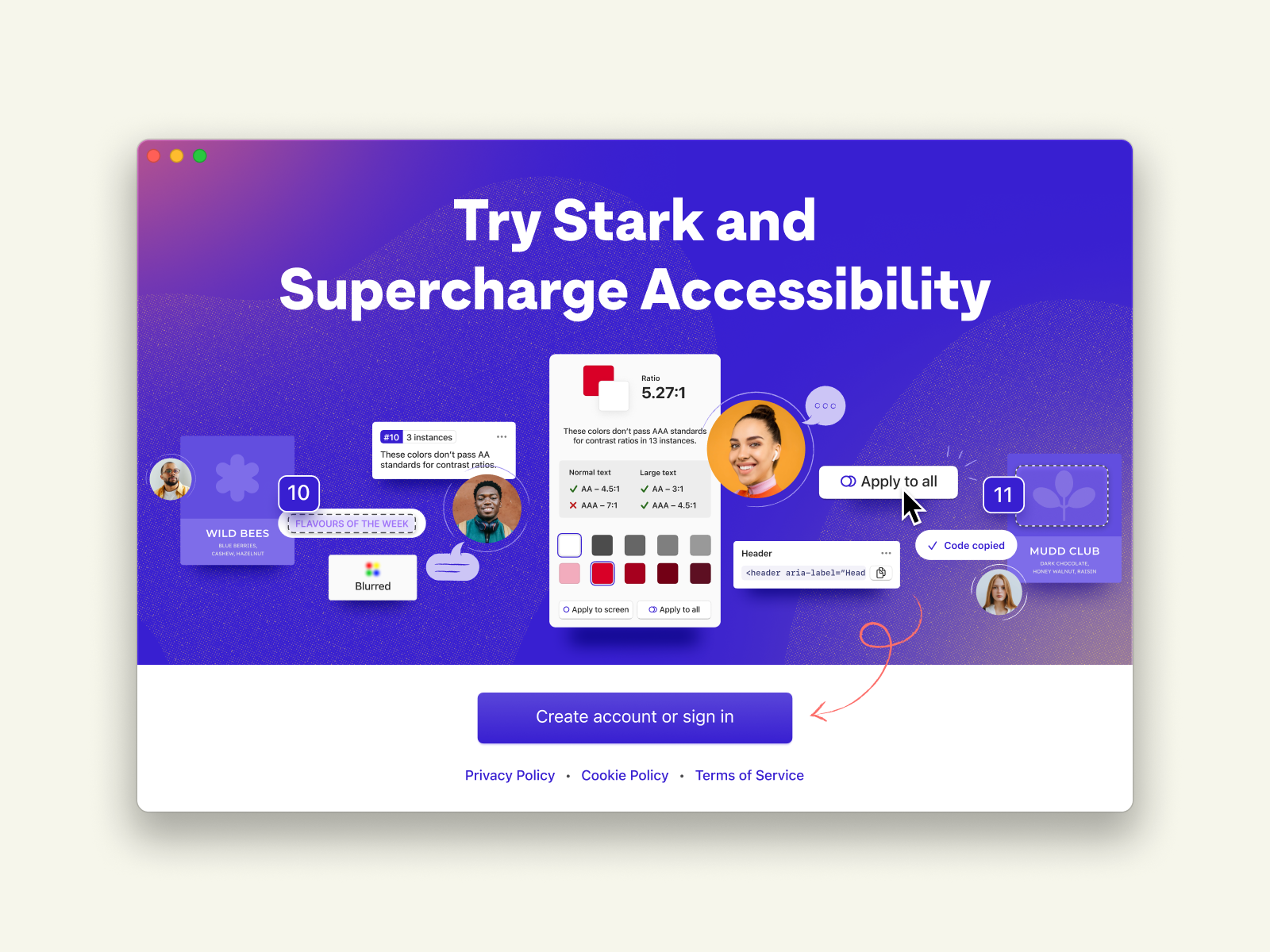
Supercharge accessibility. Stark for Mac is an all in one accessibility power tool.
Designing Stark for Mac entailed not only rapidly growing an understanding of accessibility and the WCAG but also laser focus on identifying the most impactful problems we could solve at the outset.
As the first design hire and lead designer on the product, I was responsible for strategy, research, synthesis, journey maps, and the final designed product.
Description
Supercharge accessibility. Stark for Mac is an all in one accessibility power tool.
Designing Stark for Mac entailed not only rapidly growing an understanding of accessibility and the WCAG but also laser focus on identifying the most impactful problems we could solve at the outset.
As the first design hire and lead designer on the product, I was responsible for strategy, research, synthesis, journey maps, and the final designed product.
Impact
- Flagship product driving enterprise account growth
- At launch 650 daily active users
- App Store rating of 5 stars
- Thousands of accessibility bugs audited
How do you fix all of product development?
It’s a simple but massive question. And it’s what I was tasked with at the outset of starting the Stark for Mac design process.
Accessibility is tricky. The WCAG (Web Content Accessibility Guidelines) criteria for accessibility are complex and feel like they’re written for robots. It’s also often something that is not prioritized.
But that’s a problem for many reasons. Namely, you'll get sued and you’re limiting your own business’s growth potential. Given that 1 billion people worldwide have a disability, or 15 to 30% of the population (depending on how you segment/who you ask) you’re leaving massive amounts of money on the table.
So how do you get designers, developers, and product managers to prioritize it? And how do you make accessibility so easy that it’s a no brainer? Enter, Stark for Mac.
Step one: write some principles.
Rather than be aimless, I decided it would be best to have some guiding tenets to call back to as I went. These actually ended up directly influencing and melding with the company’s values.
Principles
Accessibility means your job done right
Be a sherpa or a coach, not a judge or jury
Extend existing workflows, don't replace them
Give the right level of detail at the right time
Now map all of the product development pipeline
In order to come to more clarity around what the product should be, I started with a user journey map with user roles baked in. The goal here was to visualize everything and find where we can meaningfully impact the journey for our target users.
User roles
User roles
- Designer
- Engineer/Developer
- Product Manager
- Stakeholder/client
What did we learn?
This highlighted obvious quick win areas we could focus on for solving accessibility across the product development pipeline. Specifically, that it’s best to get in early but there’s a ton of impact to be made for audits and retrofitting work that has already shipped.
This highlighted obvious quick win areas we could focus on for solving accessibility across the product development pipeline. Specifically, that it’s best to get in early but there’s a ton of impact to be made for audits and retrofitting work that has already shipped.
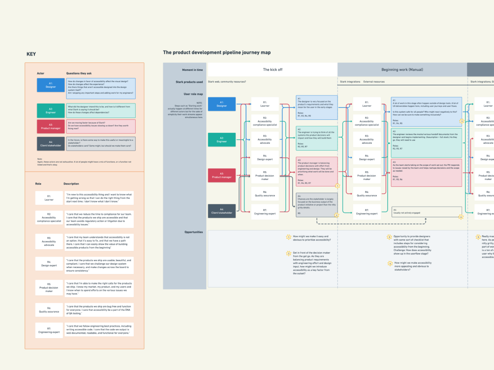
Journey map
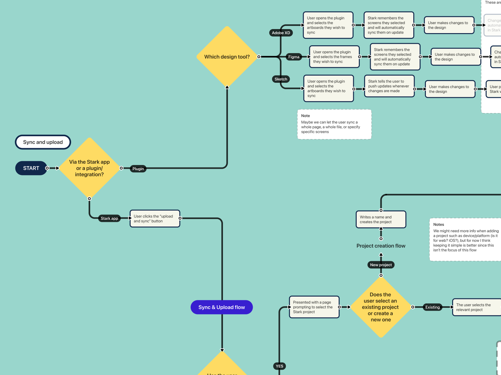
User flow
Now make it tangible
I love a good journey map. I love a good userflow. But mostly they mean nothing to anyone but the designer or the person who made them. So, naturally, my next step is always to make something tangible. Or, simply put, design some screens.
At the outset I was handed a single napkin sketch from the CEO for what this product could potentially be. TLDR? Think Grammarly... but for accessibility...
So I got to wireframing and sketching.
At the outset I was handed a single napkin sketch from the CEO for what this product could potentially be. TLDR? Think Grammarly... but for accessibility...
So I got to wireframing and sketching.
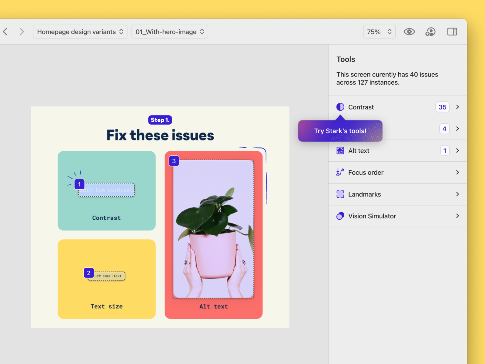
Some features started to pop out to us
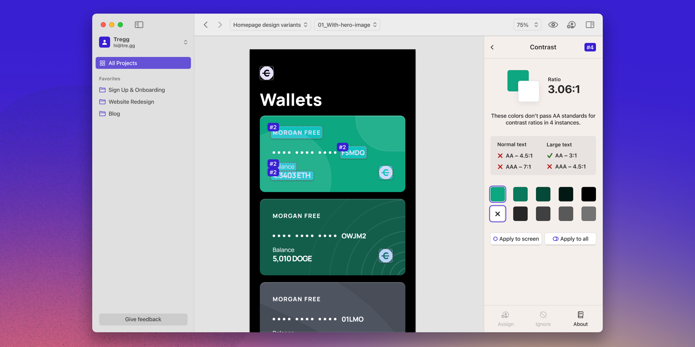
- Automatic issue detection, starting with contrast
- Seeing all of the issues at a project level
- Suggesting fixes for the issues
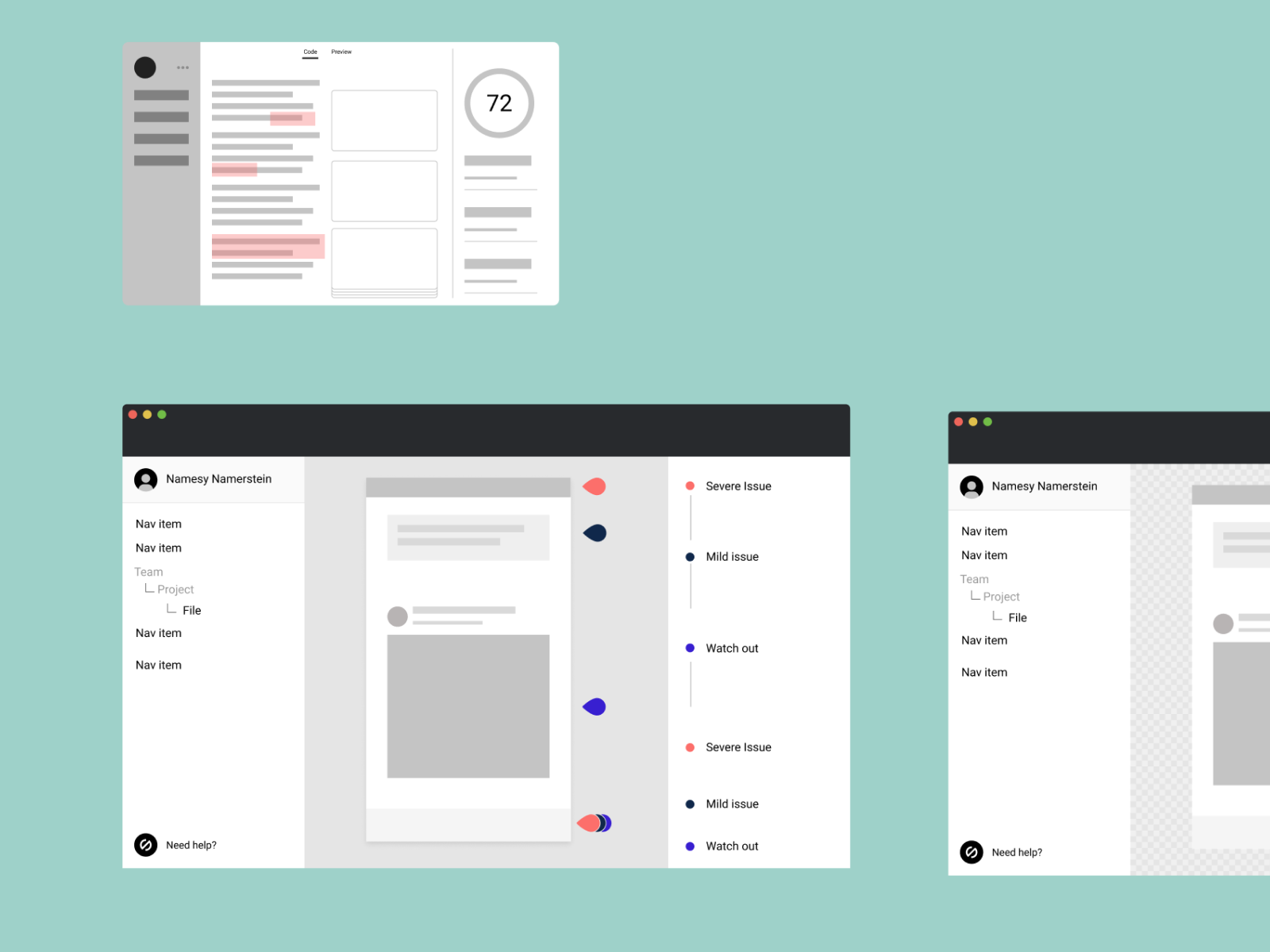
Early wireframes
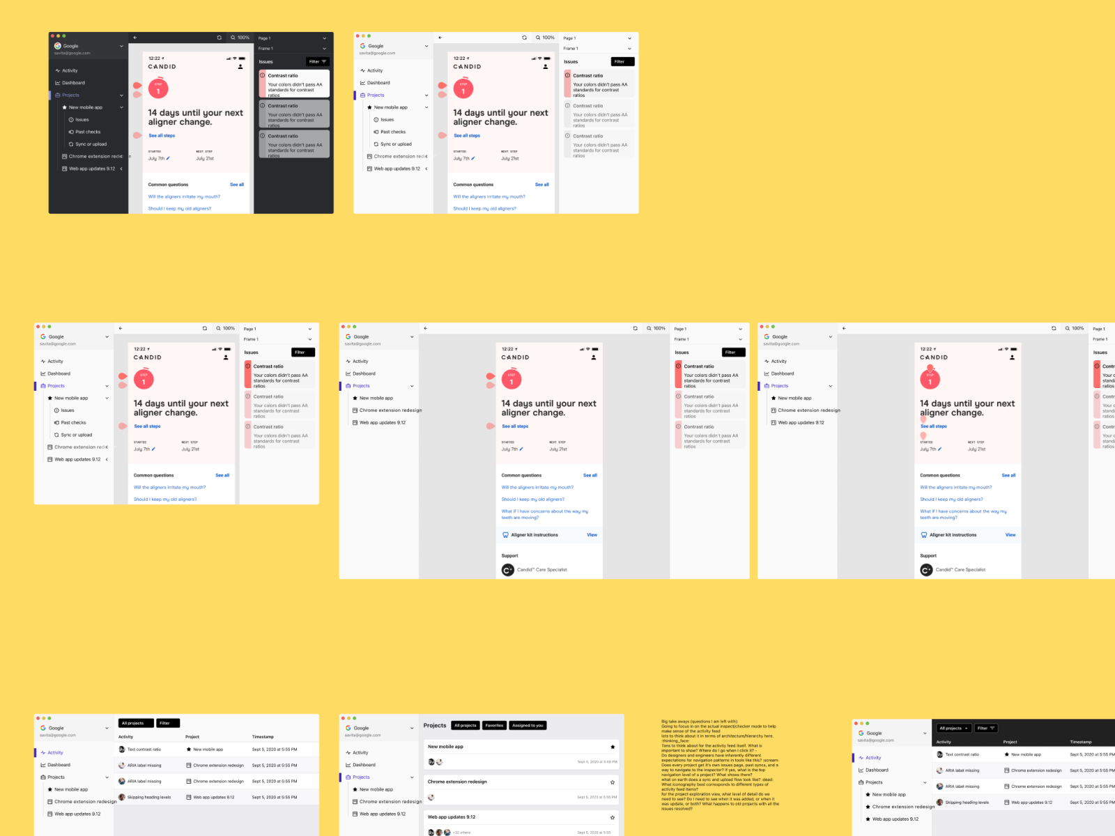
Getting higher fidelity
Okay, but what works and what doesn't?
Enter... research. I strongly believe in research. It is transformative for the organization, the product, and the business. People who have a sour taste for research have seen it used and conducted poorly. Just my hot take.
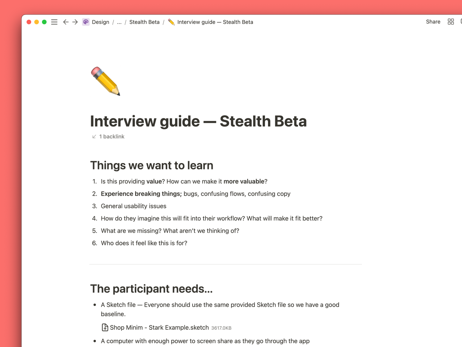
So, in favor of that, I set out to run quick and dirty user tests as quickly and cheaply as possible. The process is simple:
So, in favor of that, I set out to run quick and dirty user tests as quickly and cheaply as possible. The process is simple:
Research
Make some prototypes.
Write a test guide.
Find some participants.
Do the research.
Make it mean something.
What did we learn?
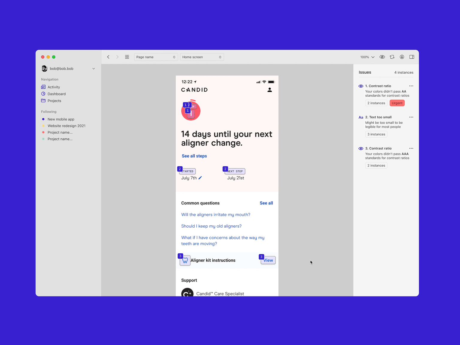
Each round revealed different things, but ultimately we were seeing obvious value in the automatic detection of accessibility issues. We had some amazing "Aha!" moments with our participants where the power of this tool clicked.
We felt very validated about the core concept and also were able to highlight obvious problems. The biggest and hardest to crack of which was the metal model around grouping similar issues and how to display the count.
If you have a color pairing that persistently produces an error, we lump that together as a single issue across many instances. This allows you to fix it at a higher level, rather than needing to manually fix each individual pairing. However, communicating this clearly was a challenge. Doing these rounds of research allowed us to identify that issue and provide a solve, validating it as we went.
Research guide
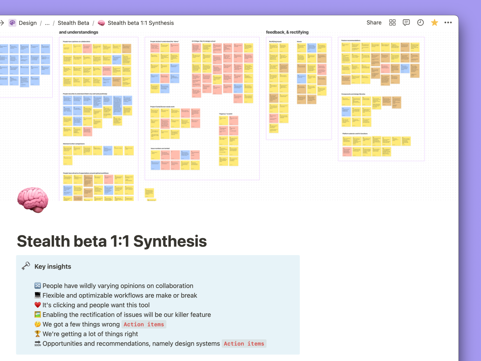
Research Synthesis
Run three user tests, a stealth beta program, and a public beta, and you end up with something like this...
The classic 1, 2, skip a few. Included in this skip are having to manually recreate all of macOS Big Sur UI ourselves as Apple had not yet released a UI kit. It was quite the process.
Splash screen
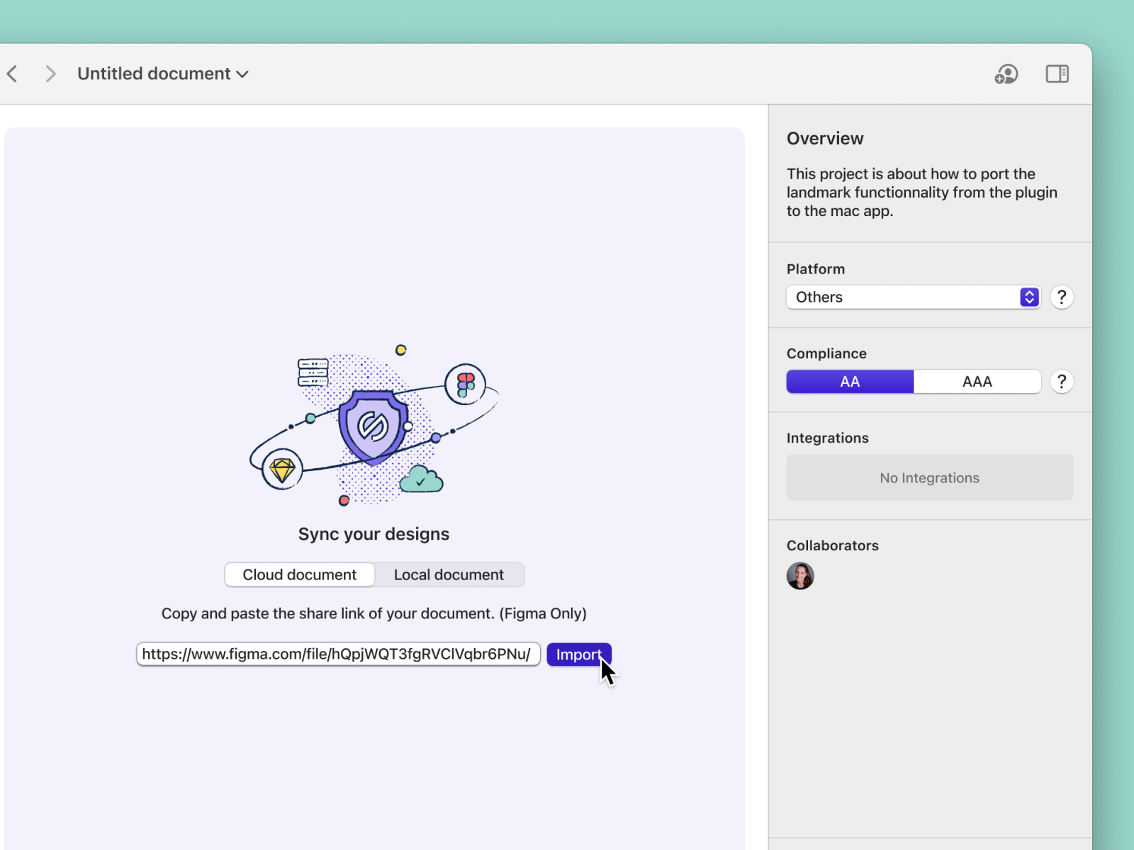
File import
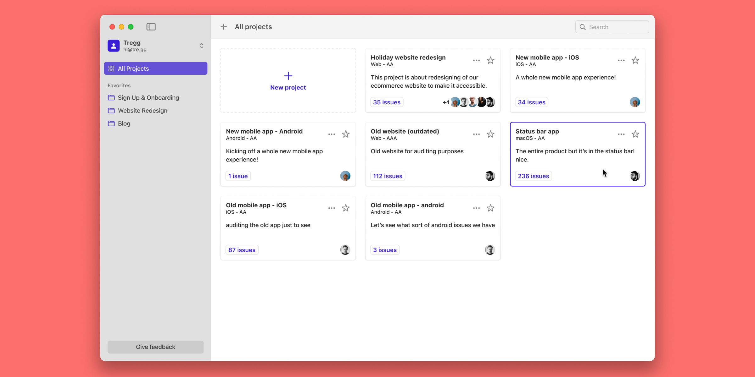
Project cards
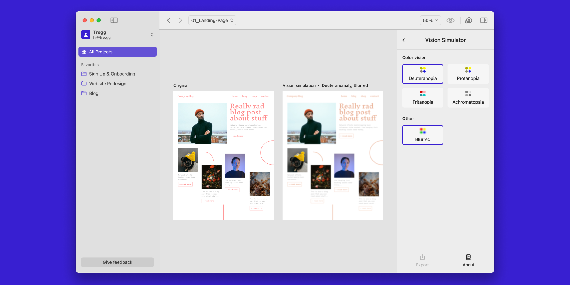
Vision simulator
Mind the interactions
Having buttery smooth, intuitive, native macOS feeling interactions was imperative to the success of this application. A lot of time was spent designing and caring for the small interactions and gestures.
Designers and makers as a whole have an increased sensitivity to the way that software products feel to use. We’re used to world class designed products in our day to day workflows, so it was paramount that Stark for Mac lived up to those high standards.
Designers and makers as a whole have an increased sensitivity to the way that software products feel to use. We’re used to world class designed products in our day to day workflows, so it was paramount that Stark for Mac lived up to those high standards.
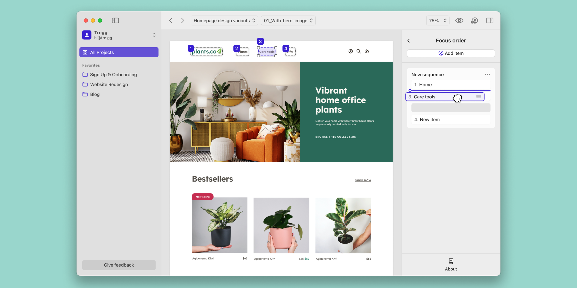
Focus order
Annotation hover
Onboarding nudges
Old Hover Prototype

Annotation drawing
Conclusion
Stark for Mac frankly took a very long time to design and build due to the monolithic nature of the problems we are solving here. But in the end we created a one of a kind, industry first piece of software that brings automatic accessibility audits into the designer’s toolkit. There’s nothing like it.
There’s a lot more to be done, and many things we designed that haven’t yet been built. Layers of polish as well as new and improved features still live in their Figma file format. However, I have faith that this product will make measurable impacts on many teams' workflows.
Being the first design hire at a company founded by a designer is a great honor, and Stark for Mac is the result.